Becoming a Better Runner using Data
This summer I ran a lot – almost every day. It was great to start the morning getting my blood pumping and feeling energized to start the day. However, towards the end of this summer, I started to realize that my form might be unhealthy. Sometimes, depending on the run, my right knee would be more soar than my left.
So, at the beginning of the fall semester, much to my dissatisfaction, I stopped running until I could figure out what was causing the pain.
As recently confirmed by my doctor, my right leg is longer than my left. This is not abnormal but, combined with the fact that I have flat feet, it was most likely what was causing me pain. If I want to run again, I must be especially conscious of my form. A healthy form will minimize the potentially damaging impact on my knee and ensure I don’t feel that same pain. However, that raises the question, what factors lead to a deterioration in my form?
That brings me to this post. I almost always log my runs with Runkeeper. It’s a great app that provides a lot of statistics. It also lets you export the raw data. This is an absolute gold mine for data enthusiasts like myself.
With my renewed motivation to start running again and all this data, I decided to take a deeper look into how I was running before I stopped. Below, I’ll show how to determine what might be affecting my form and what changes I can make to help maintain a more healthy one.
Let’s get started with the imports!
import datetime as dt
import pytz

import numpy as np
import pandas as pd
import xml.etree.ElementTree
import json
import requests

import pyproj
import geopandas as gpd
from shapely.geometry import Point
from shapely.wkt import loads

from plotly.offline import download_plotlyjs, init_notebook_mode, plot, iplot
import plotly.graph_objs as go
from plotly import tools
import cufflinks as cf

from bokeh.io import output_file, output_notebook, show
from bokeh.models import (
  GMapPlot, GMapOptions, ColumnDataSource, Circle, LogColorMapper, BasicTicker, ColorBar,
    DataRange1d, Range1d, PanTool, WheelZoomTool, BoxSelectTool, ResetTool
)
from bokeh.models.mappers import ColorMapper, LinearColorMapper
from bokeh.palettes import Viridis5
from bokeh.plotting import figure
from bokeh.resources import CDN
from bokeh.embed import file_html

from lib import custom_utils

init_notebook_mode(connected=True)
cf.set_config_file(world_readable=True, offline=True)
[nltk_data] Downloading package stopwords to /home/sean/nltk_data...
[nltk_data]   Package stopwords is already up-to-date!
Notice I import a module called custom_utils. This post is part of a larger project to keep track of my health and I found the need to reuse functions often. The file can be found here.
Here I’m just loading the keys I’ll need to use the APIs later.
with open('keys.json', 'r') as f:
    keys = json.loads(f.read())
Runkeeper Data
Simply go to https://runkeeper.com/exportData to get a copy of your data. I downloaded the “activity data”. It includes a summary .csv along with .gpx files for each run. I’ll only be using the summary file.
runkeeper_runs = pd.read_csv('data/01-runkeeper-data-export-2019-01-09-162557/cardioActivities.csv', parse_dates=[1])
runkeeper_runs.head()
| Activity Id | Date | Type | Route Name | Distance (mi) | Duration | Average Pace | Average Speed (mph) | Calories Burned | Climb (ft) | Average Heart Rate (bpm) | Friend's Tagged | Notes | GPX File | |
|---|---|---|---|---|---|---|---|---|---|---|---|---|---|---|
| 0 | d23a13b8-d1b5-42f5-8b08-d1a7bda837ed | 2018-11-18 11:35:37 | Running | NaN | 1.60 | 14:57 | 9:21 | 6.41 | 196.0 | 157 | NaN | NaN | NaN | 2018-11-18-113537.gpx |
| 1 | 3bc2200c-0279-49b9-bdfe-88396ad9e5a6 | 2018-10-07 06:20:38 | Running | NaN | 1.88 | 16:41 | 8:53 | 6.76 | 219.0 | 57 | NaN | NaN | NaN | 2018-10-07-062038.gpx |
| 2 | 6090742d-459a-44f1-9b3b-b9a2a22ce9e9 | 2018-10-06 07:26:19 | Running | NaN | 2.78 | 25:31 | 9:10 | 6.55 | 342.0 | 132 | NaN | NaN | NaN | 2018-10-06-072619.gpx |
| 3 | c525bb16-9942-4e8f-911f-51de038f50cd | 2018-09-29 08:25:23 | Running | NaN | 2.54 | 22:04 | 8:42 | 6.90 | 307.0 | 114 | NaN | NaN | NaN | 2018-09-29-082523.gpx |
| 4 | 744f6918-1009-41d6-bfe0-72562e7b7057 | 2018-09-17 22:53:31 | Running | NaN | 2.70 | 1:19:11 | 29:18 | 2.05 | 325.0 | 126 | NaN | NaN | NaN | 2018-09-17-225331.gpx |
Pace
In the Runkeeper data, my average pace per run might be the best indicator to how healthy my form was.
Below, I examine some basic factors that might contribute to a slower pace.
# ignore runs with invalid pace
runkeeper_runs = runkeeper_runs.dropna(subset=['Average Pace'])

# convert duration strings to timedeltas
runkeeper_runs['Average Pace'] = runkeeper_runs['Average Pace'].apply(custom_utils.duration_to_delta)
runkeeper_runs['Duration'] = runkeeper_runs['Duration'].apply(custom_utils.duration_to_delta)

# add column with pace in seconds
runkeeper_runs['avg_pace_secs'] = runkeeper_runs['Average Pace'].dt.total_seconds()

# ignore crazy outliers with pace >15 minutes (I sometimes forget to end the run)
runkeeper_runs = runkeeper_runs[runkeeper_runs['avg_pace_secs']/60 < 15].reset_index(drop=True)
Day of Week
dow_to_str = {0: 'Mon', 1: 'Tue', 2: 'Wed', 3: 'Thu', 4: 'Fri', 5: 'Sat', 6: 'Sun'}
runkeeper_runs['dow'] = runkeeper_runs['Date'].dt.dayofweek
pace_dow_avgs = runkeeper_runs.groupby(['dow'])['avg_pace_secs'].mean()
data = []
data.append(
    go.Bar(
        x=pace_dow_avgs.keys(),
        y=pace_dow_avgs.values / 60,
        name='Pace Averages'
    )
)

layout = go.Layout(
    title='Average Pace vs Day of Week',
    barmode='group',
    xaxis={
        'title': 'Day of Week (0=Mon)'
    },
    yaxis={
        'title': 'Minutes'
    }
)

fig = go.Figure(data=data, layout=layout)
iplot(fig, filename='DOW avg')
data = []
for i, dow in enumerate(sorted(runkeeper_runs['dow'].unique())):
    # get pace histogram, ignoring outliers
    pace_vals = runkeeper_runs[runkeeper_runs['dow'] == dow]['avg_pace_secs'].value_counts()

    data.append(
        go.Bar(
            x=pace_vals.keys() / 60,
            y=pace_vals.values,
            name=str(dow),
            yaxis='y' + str(i+1)
        )
    )

fig = tools.make_subplots(rows=4, cols=2, subplot_titles=[dow_to_str[day] for day in sorted(runkeeper_runs['dow'].unique())])

fig.append_trace(data[0], 1, 1)
fig.append_trace(data[1], 1, 2)
fig.append_trace(data[2], 2, 1)
fig.append_trace(data[3], 2, 2)
fig.append_trace(data[4], 3, 1)
fig.append_trace(data[5], 3, 2)
fig.append_trace(data[6], 4, 1)

for i, sem in enumerate(sorted(runkeeper_runs['dow'].unique())):
    fig['layout']['xaxis' + str(i+1)].update(range=[7, 10])
    fig['layout']['yaxis' + str(i+1)].update(range=[0, 3])

fig.layout.update(height=1000)
fig.layout.update(title='Pace Distibution by Day of Week')

iplot(fig, filename='dow pace')
This is the format of your plot grid:
[ (1,1) x1,y1 ]  [ (1,2) x2,y2 ]
[ (2,1) x3,y3 ]  [ (2,2) x4,y4 ]
[ (3,1) x5,y5 ]  [ (3,2) x6,y6 ]
[ (4,1) x7,y7 ]  [ (4,2) x8,y8 ]
Time of Day
early_avg = runkeeper_runs[runkeeper_runs['Date'].dt.hour < 9]['avg_pace_secs'].mean()
morn_avg = runkeeper_runs[(runkeeper_runs['Date'].dt.hour >= 9) & (runkeeper_runs['Date'].dt.hour < 12)]['avg_pace_secs'].mean()
after_avg = runkeeper_runs[(runkeeper_runs['Date'].dt.hour >= 12) & (runkeeper_runs['Date'].dt.hour < 7)]['avg_pace_secs'].mean()
night_avg = runkeeper_runs[runkeeper_runs['Date'].dt.hour >= 7]['avg_pace_secs'].mean()
data = []
data.append(
    go.Bar(
        x=['Early Morning', 'Morning', 'Afternoon', 'Night'],
        y=[early_avg / 60, morn_avg / 60, after_avg / 60, night_avg / 60],
        name='Pace Avgs'
    )
)

layout = go.Layout(
    title='Average Pace vs Time of Day',
    barmode='group',
    xaxis={
        'title': 'Time of Day'
    },
    yaxis={
        'title': 'Minutes'
    }
)

fig = go.Figure(data=data, layout=layout)
iplot(fig, filename='tod pace')
Distance
x = []
y = []
for i in range(5):
    x.append(str(i) + ' <= Miles < ' + str(i+1))
    y.append(runkeeper_runs[(runkeeper_runs['Distance (mi)'] >= i) & (runkeeper_runs['Distance (mi)'] < i+1)]['avg_pace_secs'].mean() / 60)
data = []
data.append(
    go.Bar(
        x=x,
        y=y,
        name='Mile Averages'
    )
)

layout = go.Layout(
    title='Average Pace vs Run Distance',
    barmode='group',
    xaxis={
        'title': 'Length of Run'
    },
    yaxis={
        'title': 'Minutes'
    }
)

fig = go.Figure(data=data, layout=layout)
iplot(fig, filename='distance pace')
Ran 36 hours Before
rr_date_sorted = runkeeper_runs.sort_values('Date').reset_index()

row_mask = (rr_date_sorted['Date'] - rr_date_sorted['Date'].shift(1)).dt.total_seconds()/3600 < 36
data = []
data.append(
    go.Bar(
        x=['Ran 36 Hrs Before', 'Didn\'t Run 36 Hrs Before'],
        y=[rr_date_sorted[row_mask]['avg_pace_secs'].mean()/60, rr_date_sorted[~row_mask]['avg_pace_secs'].mean()/60],
        name='Paces'
    )
)

layout = go.Layout(
    title='Average Pace vs If I Ran 36 hours Before',
    barmode='group',
    yaxis={
        'title': 'Minutes'
    }
)

fig = go.Figure(data=data, layout=layout)
iplot(fig, filename='ran before pace')
Observations
Honestly, my paces are a lot less sporadic than I thought they would be. It seems my sweet spot for distance is between two and three miles. Also, I had no idea that I’ve never run in the afternoon. I thought I would’ve done it at least once in the past two years.
Other than that interesting finding, there doesn’t seem to be any factor that affects my average pace. We can dig deeper by examining my speed throughout each run.
Intra-run Data
The .gpx format output by RunKeeper provides latitude, longitude, elevation, and timestamp information throughout the run. For our analysis, we can use the coordinates and timestamp to determine speed.
Using the coordinates, we can also retrieve the location for each run. I’m going to be using a modified version of a function I got from this post.
def get_town(lat, lon):
    url = "https://maps.googleapis.com/maps/api/geocode/json?"
    url += "latlng=%s,%s&sensor=false&key=%s" % (lat, lon, keys['google_geocoding_api_key'])
    v = requests.get(url)
    j = json.loads(v.text)
    components = j['results'][0]['address_components']
    town = state = None
    for c in components:
        if "locality" in c['types']:
            town = c['long_name']
        elif "administrative_area_level_1" in c['types']:
            state = c['short_name']

    return town+', '+state if state else "Unknown"
_GEOD = pyproj.Geod(ellps='WGS84')

all_meas = []
locations = []

for index, gpx_filename in enumerate(runkeeper_runs['GPX File']):
    # build path
    gpx_filepath = 'data/01-runkeeper-data-export-2019-01-09-162557/'+gpx_filename

    # load gpx
    root = xml.etree.ElementTree.parse(gpx_filepath).getroot()

    # get loop through all points
    meas = []
    for trkseg in root[0].findall('{http://www.topografix.com/GPX/1/1}trkseg'):
        for point in trkseg:
            # get data from point
            lat, lon = float(point.get('lat')), float(point.get('lon'))
            ele = float(point[0].text)
            timestamp = dt.datetime.strptime(point[1].text, '%Y-%m-%dT%H:%M:%SZ')

            if not meas:
                # add first point
                v = 0
                locations.append(get_town(lat, lon))
                time_from_start = 0
            else:
                # calculate distance
                # Source: https://stackoverflow.com/questions/24968215/python-calculate-speed-distance-direction-from-2-gps-coordinates
                try:
                    # inv returns azimuth, back azimuth and distance
                    _, _ , d = _GEOD.inv(meas[-1]['lon'], meas[-1]['lat'], lon, lat)
                except:
                    raise ValueError("Invalid MGRS point")

                # calculate time different
                t = ( (timestamp - meas[-1]['timestamp']).total_seconds() )

                # calculate speed (m/s)
                if t == 0:
                    continue

                # speed in meters per second
                v = d / t

                time_from_start = (timestamp - meas[0]['timestamp']).total_seconds()

            # append point
            meas.append({
                'timestamp': timestamp,
                'lat': lat,
                'lon': lon,
                'ele': ele,
                'location': locations[index],
                'speed': v*2.23694, # mph
                'run_idx': int(index),
                'time_from_start': time_from_start
            })

    # add this run's points to all points
    all_meas.extend(meas)


all_meas = pd.DataFrame(all_meas)
all_meas.speed.iplot(kind='histogram', bins=100)
# get points where I'm most likely running: 1 std dev away from mean
mean = all_meas.speed.mean()
std = all_meas.speed.mean()

valid_meas = all_meas[(all_meas.speed > (mean - 1*std)) & (all_meas.speed < (mean + 1*std))]
Speed vs Location
With the .gpx file provided for each run, I can map out where I usually slow down during my runs.
Over the past two years, I’ve run mostly in two locations: Amherst, MA and Cambridge, MA. The first is because I attend UMass Amherst and the second was because of my internship this summer.
Let’s take a look at the two locations to see how I maintain my speed on the routes. To do this, I’ll use Bokeh, a data visualization library similar to D3. I got the inspiration for this from this post. But first, we’ll need to do some data wrangling.
At each point, I’ll plot a dot on the graph and have it’s color represent my speed.
Now, we can just plot these points to see where I’m slowing down, right? Well, there’s a rather large problem…
len(valid_meas)
57016
Plotting all those points would be extremely graphics intensive plus, it will be impossible to interpret the data with all the overlapping.
This was actually a very difficult problem to solve. At first, I considered using a heatmap where each point has an intensity value proportional to its speed value. However, this method would be biased toward routes that I ran more often. Usually, you could normalize the heatmap using the populations of divisible sections of your data. Unfortunately, my data doesn’t exactly fit into nice political boundaries that I can use.
While researching, I stumbled upon this Stack Overflow post. Essentially, OP wants to find the mean of a column for points contained within a common polygon. This was almost exactly what I was trying to do. My next goal was to figure out how to create squares along my running routes so then I could use that geometry for a spacial join.
This ended up being sort of a dead end. Although I could create a grid of squares with a specified resolution, I would have to manually create the grid for each location I wanted and the resulting geometry usually had more points than my actual measurements. Performing the spacial join would be far too computationally expensive.
After taking a break for a few days, I devised what I think is a clever solution. To group points, I will convert them to Web Mercator and round the coordinates to the nearest 10 meters. Then, a simple groupby can be used to find the mean speed.
For those unfamiliar with GIS, the latitude and longitude points of the measurements, taken by the GPS in my phone, are in the WGS 84 projection. These spherical coordinates are useful for finding your location on the Earth, but they can make it quite difficult when working with 2D maps, especially on the web.
In 2005, Web Mercator rose to prominence when Google Maps adopted it and it is now essentially the standard for web mapping applications. It definitely has it’s downsides, as does every projection, but we can use it here. Web Mercator’s units can be interpreted as “meters” from Null Island. I put meters in quotes because the accuracy compared to an actual meter gets worse and worse as you move away from the reference point.
Because my measurements are in very tight clusters no more than 5 km in radius, my rounding method shouldn’t be affected by this inaccuracy. But, let’s test and see.
# convert to geodataframe
valid_meas['coords'] = list(zip(valid_meas.lon, valid_meas.lat))
valid_meas['coords'] = valid_meas['coords'].apply(Point)
meas_gdf = gpd.GeoDataFrame(valid_meas, geometry='coords')
meas_gdf.crs = {'init': 'epsg:4326'}

# convert to web mercator
meas_gdf = meas_gdf.to_crs({'init': 'epsg:3857'})

# round lat lon to nearest 10 "meters"
def round_base(x, base=10):
    return int(base * round(float(x)/base))

meas_gdf.coords = meas_gdf.coords.apply(lambda pt : Point((round_base(pt.x), round_base(pt.y))))

# convert back to wgs 84
meas_gdf = meas_gdf.to_crs({'init': 'epsg:4326'})

# add column with "well-known text" representation of points so the values are hashable
meas_gdf['coords_wkt'] = meas_gdf.coords.apply(lambda pt : str(pt))

# group coords and find means
speed_means = meas_gdf.groupby('coords_wkt')['speed'].mean()

# convert the indices from wkt to Point
speed_points = [loads(idx) for idx in speed_means.index]
Cambridge, MA
map_options = GMapOptions(lat=42.365, lng=-71.1, map_type="roadmap", zoom=14)

plot = GMapPlot(
    x_range=Range1d(), y_range=Range1d(), map_options=map_options
)
plot.title.text = "Cambridge Run Speed"

plot.api_key = keys['google_maps_api_key']
source = ColumnDataSource(
    data=dict(
        lat=[pt.y for pt in speed_points],
        lon=[pt.x for pt in speed_points],
        size=[5]*len(speed_points),
        color=[val for val in speed_means.values]
    )
)

color_mapper = LinearColorMapper(palette=Viridis5)

circle = Circle(x="lon", y="lat", size="size", fill_color={'field': 'color', 'transform': color_mapper}, fill_alpha=0.5, line_color=None)
plot.add_glyph(source, circle)

color_bar = ColorBar(color_mapper=color_mapper, ticker=BasicTicker(),
                     label_standoff=12, border_line_color=None, location=(0,0))
plot.add_layout(color_bar, 'right')

plot.add_tools(PanTool(), WheelZoomTool(), BoxSelectTool(), ResetTool())
output_notebook()


show(plot)
html = file_html(plot, CDN, "cambridge-avgs")
with open("cambridge-avgs.html", "w") as text_file:
    text_file.write(html)
Amherst, MA
map_options = GMapOptions(lat=42.387, lng=-72.525, map_type="roadmap", zoom=14)

plot = GMapPlot(
    x_range=Range1d(), y_range=Range1d(), map_options=map_options
)
plot.title.text = "Amherst Run Speed"

plot.api_key = keys['google_maps_api_key']
source = ColumnDataSource(
    data=dict(
        lat=[pt.y for pt in speed_points],
        lon=[pt.x for pt in speed_points],
        size=[5]*len(speed_points),
        color=[val for val in speed_means.values]
    )
)

color_mapper = LinearColorMapper(palette=Viridis5)

circle = Circle(x="lon", y="lat", size="size", fill_color={'field': 'color', 'transform': color_mapper}, fill_alpha=0.5, line_color=None)
plot.add_glyph(source, circle)

color_bar = ColorBar(color_mapper=color_mapper, ticker=BasicTicker(),
                     label_standoff=12, border_line_color=None, location=(0,0))
plot.add_layout(color_bar, 'right')

plot.add_tools(PanTool(), WheelZoomTool(), BoxSelectTool(), ResetTool())
output_notebook()


show(plot)
html = file_html(plot, CDN, "amherst-avgs")
with open("amherst-avgs.html", "w") as text_file:
    text_file.write(html)
As you can see, my method has seemed to work. If you zoom in (click the button that has a magnifying glass to activate), there are no overlapping points and they haven’t seemed to shift too much due to the inaccuracies of the projections or the lost precision when converting between projections.
Observations
My runs in Cambridge seem to be pretty consistent. From what I can tell, most of my slowdowns are caused by intersections. The dots seem to be a bit darker on Prospect Street, which is usually at the end of my run, but the difference is not significant.
UMass Amherst is where the data gets interesting. My speed on Eastman Lane (top of the map) is much darker than other spots. This also occurs around the intersection near Hampshire Dining Commons. What both of these areas have in common is elevation change. Especially at the top of Eastman (top right), the hill is very steep. Knowing this, my hypothesis that my speed would be indicative of where I get tired and my form deteriorates is most likely false. Although I might slow down a bit, the change is not nearly as significant as when I encounter a hill.
Let’s take a deeper look.
Average Speed by Route
First, let’s attempt to identify runs that came from the same route by clustering using a low threshold on the mean element-wise difference in elevation, latitude, and longitude. This is definitely a quick and dirty approach but it will work for us.
routes_idx = []
checked = []
for index1, run1 in runkeeper_runs.iterrows():
    if index1 in checked:
        continue

    route_idx = []
    for index2, run2 in runkeeper_runs.iterrows():
        if index2 in checked:
            continue

        run1_pts = valid_meas[valid_meas['run_idx'] == index1].reset_index()
        run2_pts = valid_meas[valid_meas['run_idx'] == index2].reset_index()

        if abs(run1_pts.ele - run2_pts.ele).mean() < 3 and abs(run1_pts.lat - run2_pts.lat).mean() < 0.001 and abs(run1_pts.lon - run2_pts.lon).mean() < 0.001:
            route_idx.append(index2)
            checked.append(index2)

    routes_idx.append(route_idx)
route_info = []
for idx in routes_idx:
    route_info.append([valid_meas[valid_meas['run_idx'].isin(idx)]['location'].value_counts().keys()[0], len(idx)])
It seems like index 6 and 30 contain my favorite routes for Cambridge and Amherst respectively (I didn’t display the info array because I don’t want to reveal everywhere I run). If we plot speed versus elevation over each route, we should see an approximate inverse relationship.
Since we are more concerned with a change in elevation rather than the actual value, to easily compare the two locations, I have used a range of size 50 for both plots while the scale starts at an appropriate value for each route.
data = []

means = valid_meas[valid_meas['run_idx'].isin(routes_idx[6])].groupby('time_from_start').mean()

xvals = means.index/60

data.append(
    go.Scatter(
        x=means.index/60,
        y=means.speed,
        name='Speed',
        visible="legendonly"
    )
)

data.append(
    go.Scatter(
        x=xvals,
        y=pd.Series(means.speed).rolling(window=60).mean().iloc[60-1:].values,
        name='Speed ~1 Min Moving Avg',
    )
)

data.append(
    go.Scatter(
        x=xvals,
        y=pd.Series(means.ele).rolling(window=60).mean().iloc[60-1:].values,
        name='Elevation',
        yaxis='y2'
    )
)
layout = go.Layout(
    title='Speed throughout Favorite Cambridge Route',
    barmode='group',
    xaxis={
        'title': 'Minutes from Start'
    },
    yaxis={
        'title': 'Speed (mph)',
        'range': [6, 9],
        'showgrid': False,
    },
    yaxis2={
        'title': 'Elevation (m)',
        'overlaying': 'y',
        'side': 'right',
        'range': [0, 50],
        'showgrid': False,
    },
    legend={
        'x': 0.05,
        'y': 1.0
    }
)

fig = go.Figure(data=data, layout=layout)
iplot(fig, filename='DOW avg')
map_options = GMapOptions(lat=42.371181, lng=-71.105720, map_type="roadmap", zoom=15)

plot = GMapPlot(
    x_range=Range1d(), y_range=Range1d(), map_options=map_options
)
plot.title.text = "Cambridge Run Speed"

plot.api_key = keys['google_maps_api_key']
source = ColumnDataSource(
    data=dict(
        lat=means.lat,
        lon=means.lon,
        size=[5]*len(means),
        color=means.speed
    )
)

color_mapper = LinearColorMapper(palette=Viridis5)

circle = Circle(x="lon", y="lat", size="size", fill_color={'field': 'color', 'transform': color_mapper}, fill_alpha=0.5, line_color=None)
plot.add_glyph(source, circle)

color_bar = ColorBar(color_mapper=color_mapper, ticker=BasicTicker(),
                     label_standoff=12, border_line_color=None, location=(0,0))
plot.add_layout(color_bar, 'right')

plot.add_tools(PanTool(), WheelZoomTool(), BoxSelectTool(), ResetTool())
output_notebook()


show(plot)
html = file_html(plot, CDN, "cambridge-fav")
with open("cambridge-fav.html", "w") as text_file:
    text_file.write(html)
data = []

means = valid_meas[valid_meas['run_idx'].isin(routes_idx[30])].groupby('time_from_start').mean()

xvals = means.index/60

data.append(
    go.Scatter(
        x=means.index/60,
        y=means.speed,
        name='Speed',
        visible="legendonly"
    )
)

data.append(
    go.Scatter(
        x=xvals,
        y=pd.Series(means.speed).rolling(window=60).mean().iloc[60-1:].values,
        name='Speed ~1 Min Moving Avg',
    )
)

data.append(
    go.Scatter(
        x=xvals,
        y=pd.Series(means.ele).rolling(window=60).mean().iloc[60-1:].values,
        name='Elevation',
        yaxis='y2'
    )
)
layout = go.Layout(
    title='Speed throughout Favorite Amherst Route',
    barmode='group',
    xaxis={
        'title': 'Minutes from Start'
    },
    yaxis={
        'title': 'Speed (mph)',
        'range': [6, 9],
        'showgrid': False,
    },
    yaxis2={
        'title': 'Elevation (m)',
        'overlaying': 'y',
        'side': 'right',
        'range': [70, 120],
        'showgrid': False,
    },
    legend={
        'x': 0.7,
        'y': 1.0
    }
)

fig = go.Figure(data=data, layout=layout)
iplot(fig, filename='DOW avg')
map_options = GMapOptions(lat=42.390592, lng=-72.520100, map_type="roadmap", zoom=15)

plot = GMapPlot(
    x_range=Range1d(), y_range=Range1d(), map_options=map_options
)
plot.title.text = "Amherst Run Speed"

plot.api_key = keys['google_maps_api_key']
source = ColumnDataSource(
    data=dict(
        lat=means.lat,
        lon=means.lon,
        size=[5]*len(means),
        color=means.speed
    )
)

color_mapper = LinearColorMapper(palette=Viridis5)

circle = Circle(x="lon", y="lat", size="size", fill_color={'field': 'color', 'transform': color_mapper}, fill_alpha=0.5, line_color=None)
plot.add_glyph(source, circle)

color_bar = ColorBar(color_mapper=color_mapper, ticker=BasicTicker(),
                     label_standoff=12, border_line_color=None, location=(0,0))
plot.add_layout(color_bar, 'right')

plot.add_tools(PanTool(), WheelZoomTool(), BoxSelectTool(), ResetTool())
output_notebook()


show(plot)
html = file_html(plot, CDN, "amherst-fav")
with open("amherst-fav.html", "w") as text_file:
    text_file.write(html)
Our hypothesized inverse relationship is prevalent in both plots. Speed is definitely more affected by a change in elevation than how tired I am.
There are a few things to take away from this.
-
I have to be careful on hills
At the moment, I do my best to maintain a steady pace on hills and not worry about speed and the data confirms this.
-
Location is highly correlated to speed and therefore pace
Since my changes in speed are mostly due to elevation change, the location of my run is a dependent variable that makes correlating other variables to my average pace almost impossible. This would explain why my charts at the beginning show very little information.
-
Change in form is subtle
There won’t be any easily trackable variable that indicates the quality of my form
In-Depth Visualization
If you’re interested in spinning up a similar visualization with your data, I’ve been working on modifying the code from this post to work with RunKeeper data. Here’s an example screenshot of it in action:
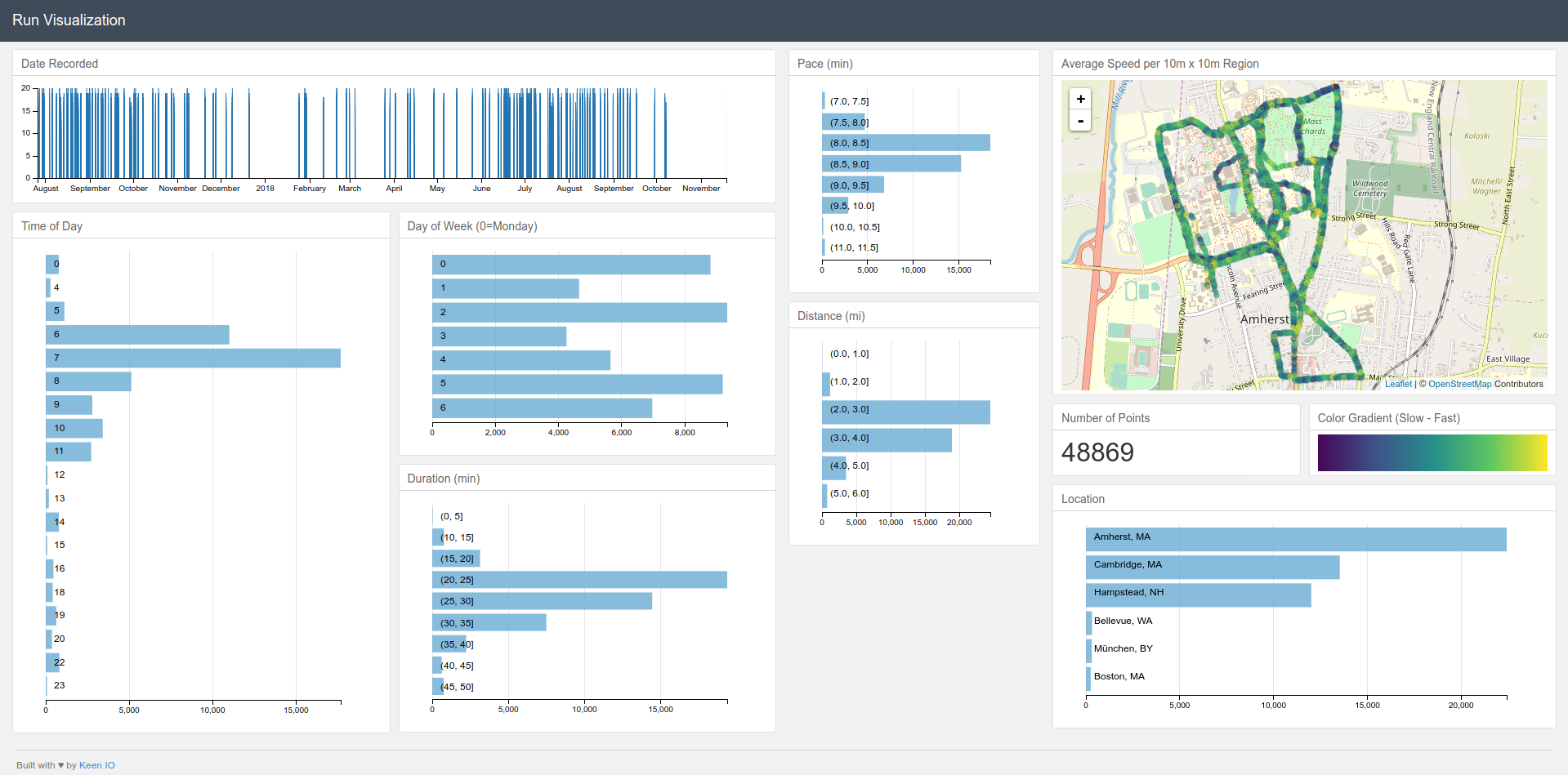
Check out the repository here.
New Running Goals
Even though we weren’t able to find any glaring indicators of bad form, there still are things I can reconsider. I’ve identified parts of my normal habits that I can change in the hopes of improving my form while stilling running often.
-
Style:
Although I love long-distance running, with recent research, interval training just seems to be better. Not only is it much lower impact, but it also seems to be better for getting into shape. Furthermore, giving myself periods of rest during the run will hopefully decrease my risk of running with poor form. This might also come with running for shorter periods of time. I will have to test it more to find what I am most comfortable with. At most I will do one long distance run per week.
-
Schedule:
Over the summer, I was running almost every day. This year, I’m going to run on Mondays, Wednesdays, and Fridays and once on the weekend. This way, I give my muscles time to recover and I could even do other exercises on the off days.
-
Route:
Seeing as I slow down a lot on hills, increasing the overall impact of my strides, I should aim to tackle hills at the beginning of the run when I am most energized. If possible, I should also run up them rather than down as to further reduce the impact.
Conclusion
To make sure I stick to my goals, I’m going to do a February check-in to compare values. However, since it is too cold to run outside, I will most likely be analyzing other factors that I can measure on treadmills.
Overall, I hope I showed a concrete example of using data to provide insights into your own habits. This can be done with any type of data that’s easily accessible. I’ve already shown how I gather insights on my productivity through my Asana data and there’s so much more.
If you’re a data enthusiast like me that loves digging up relationships from mountains of information, now is the best time to be out exploring.